In my MDes thesis, I imagined the museum audio guide as an audio-based AR experience using voice and gaze interaction. It empowers visitors to take greater control over the experience and engenders the possibility of communicating multiple narratives surrounding a work of art, rather than just one.
SUMMARY
This design centers on the famously-complex Arnolfini Portrait by Jan Van Eyck, and the design concept is inspired by its multiple interpretations.
After the narrator introduces the painting, the visitor is invited to verbally select one of three possible theories on its meaning — a depiction of the couple’s wedding, a memorial portrait for the wife, or just an elaborate demonstration of the couple’s wealth. The visitor then uses their gaze to uncover hotspots on the surface of the painting. A different narrator discusses the painting in each theory, explaining the meaning of symbols that can have multiple interpretations depending on which theory is selected.
BACKGROUND AND APPROACH
This project originated in work that I did as an undergraduate student, in which I imagined an augmented reality experience for the art museum that superimposed virtual touch targets onto the surface of a painting. This application of AR has become a reality in the years since, but there’s a fundamental awkwardness about interacting with a work in the gallery this way — seeing it in the flesh, but interacting with it on a screen-based reproduction.
“Augmented reality”, as a term, tends to describe visual experiences. However, an early definition by Milgram et. al. broadly defines AR as “augmenting natural feedback to the operator with simulated cues” — leaving open the idea that AR “natural feedback” could involve, or even center around, other senses besides vision. The new audio guide at the San Francisco Museum of Modern Art, for instance, could be considered a form of AR that augments the real-time museum experience with audio, rather than with visuals.
This lead me toward the question that drove my thesis exploration: How can visual and non-visual elements of augmented reality be utilized to make the museum audio guide richer and more interactive, yet still appropriate to context?
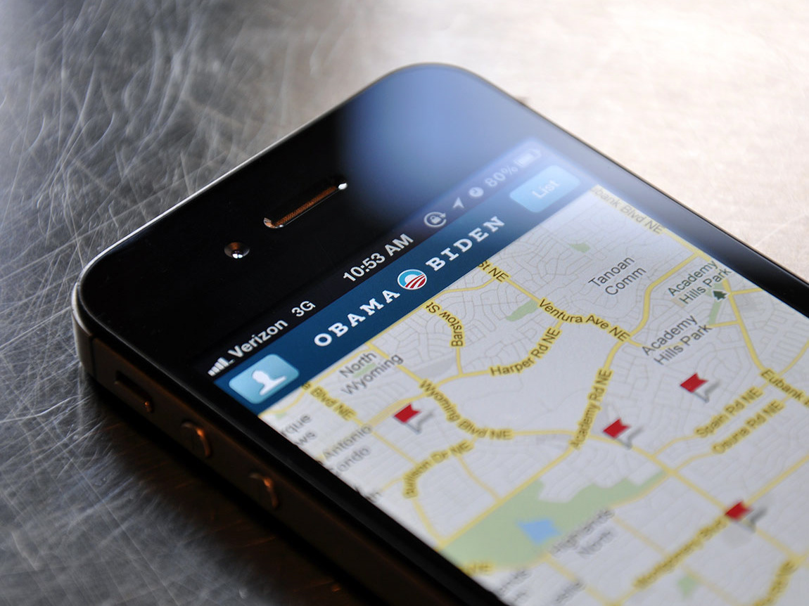
NGA Experience, an undergraduate project from 2010 where I conceptualized a smartphone-based museum AR experience.
EARLY PROTOTYPING
Initially, I proposed using an open-ended Q&A model with conversational UI, where the visitor could simply ask questions as they would with a museum docent. I also proposed using a line-of-sight gaze cursor, so the visitor could also look at something and say “who is this?”
Wizard of Oz head-mounted camera test
In this test, users wore a head-mounted camera with attached laser pointer, simulating the gaze cursor in their line of sight. It was a “Wizard of Oz” test because of the man behind the curtain, so to speak — me, sitting behind the user, acting as the voice of the computer by reading pre-written responses (and pre-written error messages for when I was stumped). I superimposed cue words on the painting as suggestions for what to ask about, which changed depending on how close users came to the screen — general terms when they were far away, and finer details when they were close.
Test conclusions
In addition to generating a lot of observations that shaped the final design, the tests showed that open-ended Q&A was not the right approach.
The narrative of the painting got scrambled and lost in open-ended Q&A. This was the most important finding. If users asked about the dog, the woman, and the mirror, they tended to learn some facts about the dog, the woman, and the mirror. But they missed the overarching theories that make this painting interesting.
Accommodating all possible intents was a losing battle. In both tests, people had great questions for which I simply would never have thought to prepare an answer, and they got an error message. But the problem would have become much worse if I were using a painting that were more abstract, containing objects that don’t have clear names (as in a surrealist work, for instance).
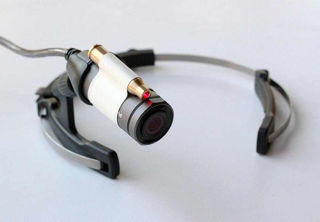
The head mounted camera with laser attachment.
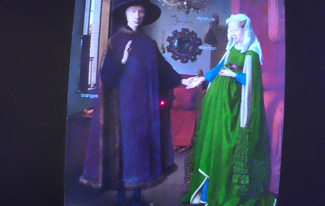
The test user’s view, showing laser in the center to simulate the gaze cursor.
Working Hololens prototype
In the testable HoloLens prototype, I abandoned open-ended questioning in favor of a more guided approach and centered the experience on the theories of interpretation. The user could adopt different interpretations by saying “It’s a memorial,” “It’s a wedding,” or “It’s just a portrait.” The gaze cursor lit up when the visitor was looking at something with information, and when selected, the visitor heard a short audio clip about it.
Unfortunately, footage recorded from the HoloLens was of very poor quality and it does not do justice to the experience of using the prototype. However, it is useful to see the choices that I made in contrast with the previous prototypes, and with the later final design.
FINAL DESIGN
Using the HoloLens prototype as the basis, I created a video prototype demonstrating the final design vision (see video at the top of the page).
Voices and music
It was important to choose the right voices, as they constituted the bulk of the experience. I worked to match voice actors with the theories they represented — a smooth, refined female voice for the wedding theory, for instance, and a deeper, older male voice for the memorial theory. In testing, many users commented that the different voices added variation to the experience and helped them to sort different pieces of information when remembering them later. A few even commented that it sounded like the narrators were debating, trying to convince the user of their chosen theory.
I also matched background music to each theory. Given the relative lack of visual cues or traditional navigation, the music which further helped to identify and distinguish between different modes in this experience.
