CareKit is Apple’s open-source toolkit for apps that help patients manage medical conditions, currently in use by Johns Hopkins, Penn Medicine, Boston Children’s Hospital, and others. During an internship at Apple (between years one and two of my Master of Design program), I designed changes to the communication of patient care progress, and then expanded CareKit with designs for the Apple Watch. Apple incorporated my proposals into a 2017 update.
AUDITING THE CURRENT DESIGN
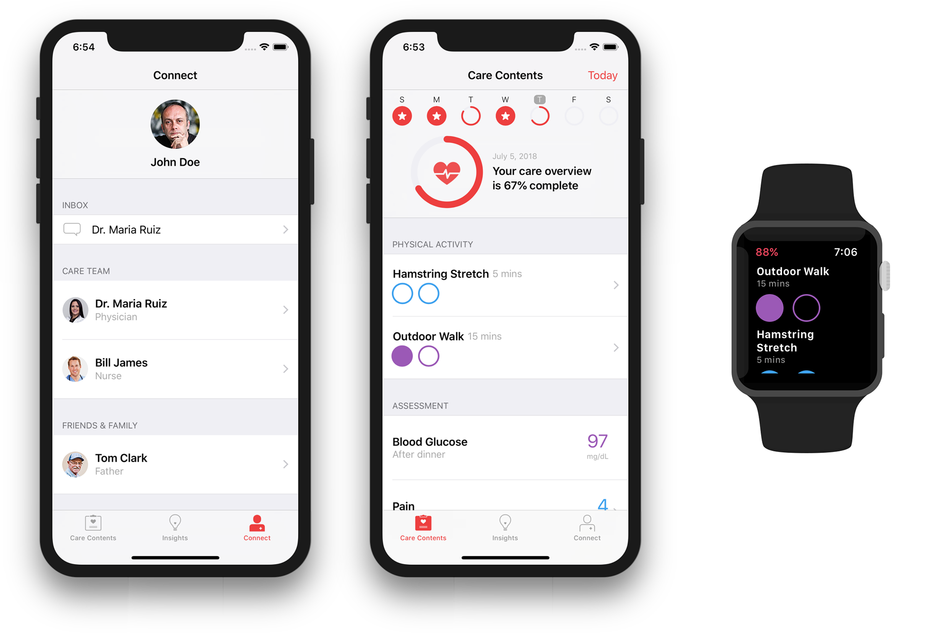
The screenshots above show the 2017 update, which incorporated and furthered design modifications that I suggested during my time on the project. They include the results of a deep dive into the display of patient progress and other suggested UI improvements.
A new progress indicator. Previously, the heart icon filled up to show the patient’s progress through their care plan. But the heart shape struggled to show when the shape was empty vs. almost empty, or full vs. almost full. It also lacked a special state or animation to show when the user had finished their care plan. A ring design with an icon in the center, however, would solve both problems.

Customizable indicators. The heart wouldn’t work for all situations, and app designers would have mixed results in trying other shapes. I suggested that we encourage customization by providing a set library of indicators for designers to use instead of the heart. The final set of 29 icons was created after my time on the project.

Natural language. Instead of “Care Completion / July 2, 2018 / 82%”, I suggested using a more natural-sounding summary at the top of the card.
UI cleanup. Spacing, typography, and overall consistency were also a part of the design audit.
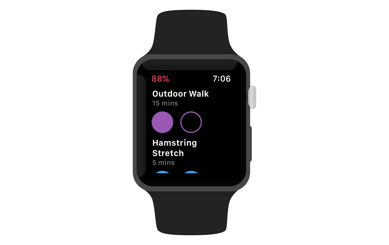
Apple Watch
I extended the CareKit design with a new design for the Apple Watch. It’s a much lighter interface, designed to support the single use case of viewing and checking off elements on the care plan. The ring progress indicator adapted well to a watch face complication.